Content projection helps us create reusable components. In Angular 1, this is called transclusion. Let us understand content projection, with an example. We want to create a reusable accordion type of control. The panel heading must be clickable, and when clicked the panel body and footer must be collapsed. Clicking on the panel heading again, must expand the collapsed panel body and footer.
Another important requirement is, this accordion panel must be reusable with any other component in our application. The component that uses this accordion panel component, must be able to specify what content it wants in the accordion panel body and footer.

For example, if we use this accordion panel, with a ProductComponent that displays a product, then in the accordion panel body, the ProductComponent may want to project and display product image, price, weight etc. In the footer, the ProductComponent may want to project and display buttons to customise the product or buy.
In our case we want to use this accordion panel, with DisplayEmployeeComponent. So in the panel body we want to project and display, employee photo, gender, date of birth, email etc. In the footer, we want to project and display buttons to View, Edit and Delete employee as shown below.

So the important question that we need to answer is, how will the components that use this accordion component be able to inject variable content into the acoordion panel body and footer.
By using <ng-content> tag
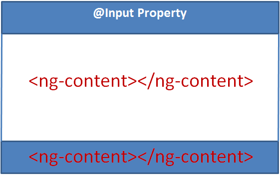
As you can see in the image below, you can think of this <ng-content> as a place holder for the variable content. In a bit we will understand, how a component that uses this accordion component can project variable content depending on the requirements of your application.

First, let's create our reusable accordion component. This is a reusable component and can be used by another component in our application. So, let's place this component in the "Shared" folder. Use the following Angular CLI command to create the component.
ng g c shared/accordion --flat
accordion.component.ts : Notice, in the component class we have introduced 3 properties. The code is commented and self-explanatory.
accordion.component.css : The "pointerCursor" class makes the cursor a pointer when hovered over panel title, so the end user knows, it is clickable.
accordion.component.html : As you can see, we have defined the shell for the accordion panel i.e accordion panel header, body and footer. We also have encapsulated the logic in this component to show and hide the panel body and footer. But the content that goes in the panel body and footer will be decided by the component that consumes this accordion component. The consuming component will also need to bind and pass data for the 3 input properties (title, isHidden and hasJustViewed).
Changes in display-employee.component.html : The changes are commented and self-explanatory.
At the moment we are using class selector to match the projection content with the ng-content slot. We can use any of the CSS selectors (class selector, element selector, attribute selector etc)
Another important requirement is, this accordion panel must be reusable with any other component in our application. The component that uses this accordion panel component, must be able to specify what content it wants in the accordion panel body and footer.

For example, if we use this accordion panel, with a ProductComponent that displays a product, then in the accordion panel body, the ProductComponent may want to project and display product image, price, weight etc. In the footer, the ProductComponent may want to project and display buttons to customise the product or buy.
In our case we want to use this accordion panel, with DisplayEmployeeComponent. So in the panel body we want to project and display, employee photo, gender, date of birth, email etc. In the footer, we want to project and display buttons to View, Edit and Delete employee as shown below.

So the important question that we need to answer is, how will the components that use this accordion component be able to inject variable content into the acoordion panel body and footer.
By using <ng-content> tag
As you can see in the image below, you can think of this <ng-content> as a place holder for the variable content. In a bit we will understand, how a component that uses this accordion component can project variable content depending on the requirements of your application.

First, let's create our reusable accordion component. This is a reusable component and can be used by another component in our application. So, let's place this component in the "Shared" folder. Use the following Angular CLI command to create the component.
ng g c shared/accordion --flat
accordion.component.ts : Notice, in the component class we have introduced 3 properties. The code is commented and self-explanatory.
export class AccordionComponent implements OnInit {
// We use this property to set a different CSS class on the employee
// panel if we have just viewed his details
@Input() hasJustViewed: boolean;
// Sets the panel title, in our case the name of the employee
@Input() title: string;
// Controls hiding and showing panel body and footer
@Input() isHidden = false;
constructor() { }
ngOnInit() {
}
}
accordion.component.css : The "pointerCursor" class makes the cursor a pointer when hovered over panel title, so the end user knows, it is clickable.
.pointerCursor {
cursor: pointer;
}
accordion.component.html : As you can see, we have defined the shell for the accordion panel i.e accordion panel header, body and footer. We also have encapsulated the logic in this component to show and hide the panel body and footer. But the content that goes in the panel body and footer will be decided by the component that consumes this accordion component. The consuming component will also need to bind and pass data for the 3 input properties (title, isHidden and hasJustViewed).
<!-- Add panel-success class only if hasJustViewed property is true -->
<div class="panel panel-primary" [class.panel-success]="hasJustViewed">
<!-- pointerCursor class changes the cursor style to pointer when hovered
over the employee panel title. When clicked on the title, isHidden
boolean property is toggled from true to false & vice-versa. We use
this property to toggle the visibility of panel body & footer -->
<div class="panel-heading pointerCursor" (click)="isHidden = !isHidden">
<h3 class="panel-title">{{title | uppercase}}</h3>
</div>
<div class="panel-body" [hidden]="isHidden">
<!-- ng-content specifies the slot into which the content will be projected
by the component that consumes this accordion component -->
<ng-content select=".myPanelBody"></ng-content>
</div>
<div class="panel-footer" [hidden]="isHidden">
<!-- Another slot into which the content can be projected. Since we have more
than one slot into which the content can be projected, this is called
multi-slot content projection-->
<ng-content select=".myPanelFooter"></ng-content>
</div>
</div>
Changes in display-employee.component.html : The changes are commented and self-explanatory.
<!-- Pass employee name as the value for title input property. Also set
isHidden input propety to false if you want the panel body and footer
to be collapsed on the initial page load.-->
<app-accordion [title]="employee.name" [isHidden]="true"
[hasJustViewed]="selectedEmployeeId === employee.id">
<!-- Notice myPanelBody css class is present on this <div>. This CCS class is
used as the selector on the <ng-content> tag in accordion component. So all this
content in this DIV will be projected at the location where we have <ng-content>
tag with css class selector .myPanelBody -->
<div class="col-xs-10 myPanelBody">
<div class="row vertical-align">
<div class="col-xs-4">
<img class="imageClass" [src]="employee.photoPath" />
</div>
<div class="col-xs-8">
<div class="row">
<div class="col-xs-6">
Gender
</div>
<div class="col-xs-6">
: {{employee.gender}}
</div>
</div>
<div class="row">
<div class="col-xs-6">
Date of Birth
</div>
<div class="col-xs-6">
: {{employee.dateOfBirth | date}}
</div>
</div>
<div class="row">
<div class="col-xs-6">
Contact Preference
</div>
<div class="col-xs-6">
: {{employee.contactPreference}}
</div>
</div>
<div class="row">
<div class="col-xs-6">
Phone
</div>
<div class="col-xs-6">
: {{employee.phoneNumber}}
</div>
</div>
<div class="row">
<div class="col-xs-6">
Email
</div>
<div class="col-xs-6">
: {{employee.email}}
</div>
</div>
<div class="row">
<div class="col-xs-6">
Department
</div>
<div class="col-xs-6" [ngSwitch]="employee.department">
:
<span *ngSwitchCase="1">Help Desk</span>
<span *ngSwitchCase="2">HR</span>
<span *ngSwitchCase="3">IT</span>
<span *ngSwitchCase="4">Payroll</span>
<span *ngSwitchDefault>N/A</span>
</div>
</div>
<div class="row">
<div class="col-xs-6">
Is Active
</div>
<div class="col-xs-6">
: {{employee.isActive}}
</div>
</div>
</div>
</div>
</div>
<!-- The content in the following DIV will be projected at the location
where we have <ng-content> tag with css selector .myPanelFooter -->
<div class="myPanelFooter">
<button class="btn btn-primary" (click)="viewEmployee()">View</button>
<button class="btn btn-primary" (click)="editEmployee()">Edit</button>
<span *ngIf="confirmDelete">
<span>Are you sure you want to delete ?</span>
<button class="btn btn-danger" (click)="deleteEmployee()">Yes</button>
<button class="btn btn-primary" (click)="confirmDelete=false">No</button>
</span>
<span *ngIf="!confirmDelete">
<button class="btn btn-danger" (click)="confirmDelete=true">Delete</button>
</span>
</div>
</app-accordion>
At the moment we are using class selector to match the projection content with the ng-content slot. We can use any of the CSS selectors (class selector, element selector, attribute selector etc)


No comments:
Post a Comment